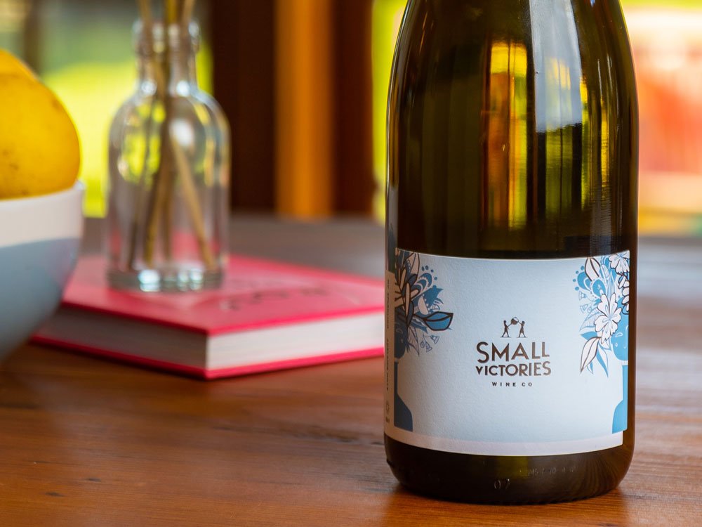
Small Victories contacted me with the idea to collaborate on their next wine release, their first ever sparkling! They told me it would have a zesty, vibrant flavour with a creamy texture. Could I create a design to match?
I was up for the challenge! One year later, the wine has finally been bottled, labeled, and released!
Here’s three reasons why this collaboration was so much fun to work on.
#1 The Company
I hadn’t heard of Small Victories until they asked me to be involved with this project. (So naturally, I did some quick googling!) I soon found out that this is a family business run by two talented sisters-in-law, Jules and Bec Ashmed. I was also drawn to the colourful labels (of course, I’m addicted to colour!), plus I could see on their website they have a big focus on sustainability and also partner with Variety and Trees for Life.
So that got me thinking… this is looking pretty positive; a female ran business, that’s local, makes great wine, and gives back to the community? This was sounding like something I wanted to be part of.
If you’re considering a collaboration, do your research. For it to be successful for everyone involved, it’s important that you have similar values and can work on the same vision for the project.
#2 The Creative Process
Before either of us committed to this project, we emailed back and forth about ideas, constraints, timelines and yes, this involved discussing the budget and writing up a quote. (Oh, how I hate talking money in a creative process!)
But in the long run, having clear expectations helps everyone! The Small Victories team have been a dream to work with. We nutted out all the details and I got to start the fun part… DRAWING!
You don’t want to jump into a collaboration that squashes your creativity and becomes frustrating and difficult. Working together should mean you’re both bringing ideas to the table and that is inspiring you to make new ideas that you otherwise wouldn’t have done without the project. That’s really the beauty of collaboration, so make sure that’s in the centre.
#3 THE PRODUCT
I love wine! (So you won’t see me doing a TimTam collaboration, I’ve just never been a fan! Sorry Arnotts!)
When I started the designs for this label, Jules and Bec sent me a bottle of their Rosé to try. This also meant I got a close-up look at their current labels. Two things I LOVED – they have quotes on the back of the label that makes you smile and the wine wasn’t just good, it was DELICIOUS.
BAM!
They won me over and all the boxes were ticked, I was inspired and I believed in their product and believed they would make an incredible sparkling, and they have! Last week they invited me to their cellar door in Nuriootpa and I finally got to see the printed label in the flesh and have my first taste! I’m delighted with how well the label and bubbles match.
So let me tell you a bit more about the label design. I first started drawing with pen and this image of a women just started to evolve. I wanted her eyes to be closed to symbolise that she is centred and really taking in the moment. She is breathing in, pausing to uncover peace and appreciation for the accomplishments in her day. She has native Australian plants growing wildly and blooming beautifully from her mind. No matter what challenge lies ahead, in this moment she is calm.
I have created two drawings of this design, the first is ink on paper and the second is full of colour with ink and layers of gouache. Jules and Bec have framed this coloured piece and it is now hanging in their cellar door.
During the refinement process we made the decision to simplify the colours, making it all about the illustration details. There’s some added glam with highlights of silver and calming blue tones.
I’m so excited I said YES to this collab, now won’t you celebrate with me? Let’s pop a bottle! CHEERS!
Jules, Leah and Bec at Small Victories cellar door.
To discover more about this project, and learn about the flavours of this Chardonnay and Pinot Noir blended sparkling, check out Small Victories blog.


